
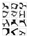
Sketches

Letter Sketches - B - Page 1

Letter Sketches - B - Page 2
Prototypes and Compositions
-
- Letter Sketches – B – Page 1
-
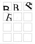
- Letter Sketches – B – Page 2


Final Composition

Final Composition
My particular reason for choosing this as the final piece for this project has to do with the nature of how the letter B is constructed. It is interesting to note that the letter B starts the word bisect, for I feel that is at the crux of what makes it such an interesting counterform. The problem is that it then does exactly the opposite of what I would prefer it to do — the central strokes all cut apart the white space. While this is certainly a visually pleasing effect, as shown in the thumbnails above, one loses the sense of the white space being intruded upon from behind rather than from above. While the foreground/background relationship is more visible there, it also lacks a sense of unified wholeness. With this particular section of the letter, however, we find that the serif at the bottom of the B serves perfectly, almost as a probe, into the space. The juxtaposition of curves and angles makes the image feel more like it was in some way off balance, yet perfectly whole.
Musings/Ideas
After looking through some of the thumbnails for this project, it occurred to me that trying to figure out how to place the letter B properly was prompting a train of thought. A crazy train, but then those are the best kinds.
If you notice, the letter B is very similar to the letters P, R, and U. Well, in terms of the curves used as part of each counterform. So I asked myself,”Self, what could that mean?” It means that if you’re zoomed in too far, you’re going to see a curve that doesn’t carry any symbolism of language. So what’s the defining characteristics of the letter B?
The letter B can be visually defined by its two large “humps”, or curvatures attached to a vertical form. Sarifs extend the curvatures past the vertical as perpendicular lines. If we have only a single curvature, we would be very hard pressed to identify it as the intended idea.
SO! I wondered if there were any psychological studies on the impression of symbols on the mind, and then later identification of these symbols at various angles and levels of zoom. Lo and behold, I found an APA study on that exact thesis. I’ll probably post the abstract here later when I can dig it up again.
(The above is utterly unrelated to the task at hand, admittedly, but it is on the back roads of the mind that one stumbles over chests of gold. Or the corpses of previous travelers. I don’t recall which is more common. Best to leave that alone.)
